With this being such a busy time of year we will have a short holiday break. Check the right hand side of the screen to find your next Monday Post.
As always, feel free to post a new blog entry if you have a question or need help or have something neat to share.
Also, we would love to have others join us! You may have been using a camera for 70 years or 7 days, we still would love to have you join us. Post do not necessarily need to be tutorials. You can ask a question, present a challenge, ask for critique, or submit a picture and ask everyone to photoshop it to see the different ways people approach a photo. Lots of possibilities, get out of your comfort zone and join us =)
Saturday, December 6, 2008
Monday, December 1, 2008
My color has a temperature!
As it turns out, all color has a temperature - measured in degrees kelvin, whatever that is!
The kelvin system of temperature measurement is very much like the celcius system, but it starts with zero at absolute zero instead of -273.15°C.
Right about now you're probably wondering what this has to with photography, aren't you? The short answer is...nothing at the low end of the scale. However, color temperature is a characteristic of visible light and is measured in degrees kelvin, which makes it important to know a little about it. Both the amount of light and the color temperature affect how the image appears in the finished product.
I know it's counter intuitive, but the hotter the temperature of a color, the cooler it is considered to be.
 |
| Color Temperature image taken from Wikipedia |
The table below gives a pretty good idea of the color temperature for a variety of different light sources:
| Temperature | Source |
|---|---|
| 1700 °K | Match flame |
| 1850 °K | Candle flame |
| 2800–3300 °K | Incandescent light bulb |
| 3350 °K | Studio "CP" light |
| 3400 °K | Studio lamps, photofloods, etc. |
| 4100 °K | Moonlight, xenon arc lamp |
| 5000 K | Horizon daylight |
| 5500–6000 °K | Typical daylight, electronic flash |
| 6500 °K | Daylight, overcast |
| 9300 K | CRT screen |
| Note: These temperatures are merely approximations; considerable variation may be present. | |
As you can see from the table, all of the sources are actually hot: flame, incandescents, the sun, etc. However, there is a conversion system that give you some idea of the color temperature of fluorescent bulbs called the correlated color temperature (CCT), which has to do with the perceived color of the blah, blah, blah. Here is more than you ever wanted to know about color temperature.
Now for a bit of setup information. I went to Home Depot an bought some metal reflectors and fluorescent bulbs. The bulbs are not very expensive, even though it says $77 dollars in the pictures (that's actually the savings over using an incandescent bulb). The prices were about $4 for two of the bulbs and $6 for the third one. However, if you want, you can go to B&H's web site and pay a couple hundred buck if you want...


I used a peninsula cabinet for the setup. First, I draped a roll of kraft paper over a box to create a cove. (A cove is just a way to get a nice smooth corner as a backdrop for your subject. The principle is the same if you are shooting people or things.) Next, I clamped the reflector to one of my old tripods and mounted the camera on the good tripod. I placed an 18% gray card on the cove (as a reference) and placed the subject on the card. That pretty much tells the whole setup story, so check out the picture below to see what I'm talking about. 
Then I took a series of pictures - two with each bulb. The first image is always with the light source to the left. The second image always uses a reflector to fill in the light on the right (move the reflector around until you can see the subject being filled with a reflection of the light source in the left).
This first set of picture uses the Daylight bulb. I estimate the color temperature to be around 6000K, or the daylight range. Notice how realistic the images look - almost as though they were taken outside. Also notice the second image with the light filled in on the right as the light source is reflected back on to the subject.
| f/4.0, 1/40, iso400, AE, 18.0mm Focal length | f/4.5, 1/50, iso400, AE, 18.0mm focal length |
 |  |
This next set of images uses the Bright White bulb. Here, I estimate a color temperature of about 4500K, or the moonlight/Horizon daylight range - early sunset type of lighting. Now you see the image start to approach the yellow end of the spectrum.
| f/4.5, 1/20, iso400, AE, 18.0mm Focal length | f/4.5, 1/25, iso400, AE, 18.0mm focal length |
 |  |
Lastly, the Soft White bulb supplies the light. I'm guessing somewhere around 3300K, which is something like using available light in your living room. Notice how warm the images have become as the light source approaches the yellow end of the visible light spectrum even more. Also, the farther you are from your light source the warmer the picture will be. The reason is simple physics - a little principle they all the inverse-square law. All you really need to know about this inverse-square law is an object twice as far away from the source, receives only ¼ the light energy. And here is more than you ever wanted to know about the inverse-square law.
| f/4.5, 1/25, iso400, AE, 18.0mm Focal length | f/4.5, 1/30, iso400, AE, 18.0mm focal length |
 |  |
The three lighting situations simulated here are bright sunlight where the sun is primarily over head, early evening and available light inside the house. I tried to keep the camera pretty much at the same settings, even though the shutter speed did vary a bit.
That's pretty much it. Now that you got a basic understanding (and I do mean basic), give it a try. Select your lighting condition and start shooting. I'm looking forward to seeing what you come up with.
Wednesday, November 19, 2008
More Shaped Bokeh
 I noticed once I had the pictures on the computer that his eye was OOF. I guess that's the bad thing about using such a big aperture. I'll try this again, just wanted to post some more.
 The punches I used are about the same size as a dime. Or about 1.5 cm across.
I tried the horseshoe shape just now. I wasn't sure how a shape like that would work. So as long as the sizing is right it should work.
I am wondering how everyone is doing with this.
Monday, November 17, 2008
Bokeh Baby!
**EDIT**
* You will need to give yourself some distance between you and your light source.
* If you do not have a big aperture you will need to use a smaller hole.
------------------------------------
Let's start on the pronunciation, shall we?
Bokeh is like "you say potato, I say potato, potato, potato" , "you say tomato, I say tomato, tomato, tomato, let's call the whole thing off ". I pronounce bokeh to rhyme with mocha, and I don't even drink coffee! So, maybe you pronounce it bo-kay, and that's okay, let's just get some bokeh!!!
Bokeh refers to the blurring of the background when you have a shallow depth of field. And we all know what DOF or depth of field is, right? Good I thought so, and if not just take a peek back at Cy's post here.
Personally, when I think of bokeh I don't just think of DOF, I think of what is happening with the lighting in the background. Leaves in the sunlight will often produce some great bokeh. In this next shot there is some bokeh going on in the back (hard to see with that punk that is goofing off, I know).

But what I really wanted to focus on today was getting SHAPED bokeh. Are you in? Here is a string of Christmas lights on the floor. Using manual focus I focused on the lights. Wow, spectacular isn't it! Just kidding, just looks like a tangled mess ready to happen. But now look at what happens when I manually move my focus away from the lights and closer to me....
 Pretty cool, huh? Now that you get what I'm doing here let's start taking it a little further.

Ahhhhh, heart bokeh.
 Some ordinary looking candles but look what happens when I turn off the lights and I try to get a shaped bokeh to appear for me.......

A-ha! Heart bokeh!
* You will need to give yourself some distance between you and your light source.
* If you do not have a big aperture you will need to use a smaller hole.
------------------------------------
Let's start on the pronunciation, shall we?
Bokeh is like "you say potato, I say potato, potato, potato" , "you say tomato, I say tomato, tomato, tomato, let's call the whole thing off ". I pronounce bokeh to rhyme with mocha, and I don't even drink coffee! So, maybe you pronounce it bo-kay, and that's okay, let's just get some bokeh!!!
Bokeh refers to the blurring of the background when you have a shallow depth of field. And we all know what DOF or depth of field is, right? Good I thought so, and if not just take a peek back at Cy's post here.
Personally, when I think of bokeh I don't just think of DOF, I think of what is happening with the lighting in the background. Leaves in the sunlight will often produce some great bokeh. In this next shot there is some bokeh going on in the back (hard to see with that punk that is goofing off, I know).

But what I really wanted to focus on today was getting SHAPED bokeh. Are you in?
Here is a string of Christmas lights on the floor. Using manual focus I focused on the lights. Wow, spectacular isn't it! Just kidding, just looks like a tangled mess ready to happen. But now look at what happens when I manually move my focus away from the lights and closer to me.... Pretty cool, huh? Now that you get what I'm doing here let's start taking it a little further.
Ahhhhh, heart bokeh.
 Some ordinary looking candles but look what happens when I turn off the lights and I try to get a shaped bokeh to appear for me.......
A-ha! Heart bokeh!
And here is how you are going to get it....
 You'll need to use your biggest aperture (smallest F-stop) for this. I used my 50mm lens which has a f-stop of 1.8. If you don't have this you may need to just play around with the size of the hole you are working with.
 You'll need to use your biggest aperture (smallest F-stop) for this. I used my 50mm lens which has a f-stop of 1.8. If you don't have this you may need to just play around with the size of the hole you are working with.
 Start by tracing around your lens on a black piece of paper. Cut that out and then to make it easier to use with your punch/hole or use with multiple shapes cut another section out of that circle.
 And with another small piece of paper cut or punch out your shape. Tape it onto the large circle and wah-lah....

If you decide to give this a try, please submit your pictures so we can see what you came up with.
 And with another small piece of paper cut or punch out your shape. Tape it onto the large circle and wah-lah....
If you decide to give this a try, please submit your pictures so we can see what you came up with.
If you are not part of this group and want to give this a try, let me know by leaving a comment and we can get your pictures up here too!
Have fun with your bokeh.
Tuesday, November 11, 2008
Can you say confused?

I am having a hard time getting this last example. I love what Mazz did but I am having a hard time figuring it out. I cheated on the above picture and didn't do it Mazz's way. I cut out the boy and added the background and then I lowered the opacity of the background paper. I don't seem to be able to find a blending mode. Is it right in front of my face and I just don't see it? Is it because I am only using Elements and not the full version? Is it because I need Photoshop for Dummies? I am frustrated because I generally get these things but I'm not getting this last tutorial. Do I need to dump the money in and get CS4?
All help is appreciated. Seriously... HELP!
Monday, November 10, 2008
Just Playing Around
Well, I had a little fun with this picture; never did really like the background of the image so putting the lesson to the test and this was what I ended up with...
 |  |
Rock Out Your Photos
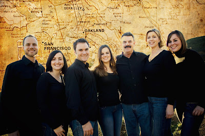
Would you like your photos to look like they are ready for Rolling Stone magazine? Here are a few options to look into. When putting this assignment together for my class, I am teaching Intro to Computer Art 2201 at Seattle Pacific University, I told them to pretend that they have be asked by a client to take their family photos and add some "edge" to them (clients are always asking for edgy design).
Step One: Pick your photo
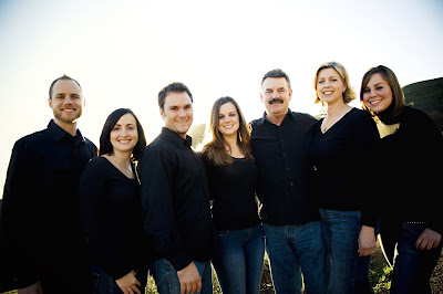
Step Two: Pick a texture. In my case I choose some yellowed paper. It is best to scan it in or take the photo yourself of a texture like cracked clay, a weathered bar door, etc.

Step Three: Pick your second texture. I love maps and text so I found a map of the Bay Area.
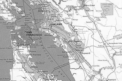
Step Four: You will apply a blending mode to the layer. I choose Darker Color. I then realized it made my subjects have yellow teeth so I lightly erase that area on the face, but making sure I was on the texture layer.
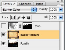
Step Five: You will now want to create a mask around your photo subject. Use the Lasso tool. Then add it in the channel tab. This will allow you to mask the map layer so that it does not cover of your subjects. Apply the mask to your map layer by clicking on the mask icon at the bottom of the layers palette. You can also apply a blending mode to your layer. I choose to use color burn.
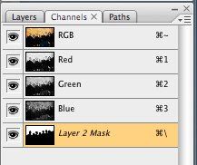
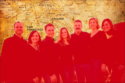
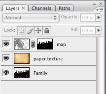
Step 6: Stand back and look at how you have rocked out your photo.
You can follow my design company, Mazzarello Media and Arts on our blog, mazzarellomedia.blogspot.com or my computer class at mazz2201.blogspot.com.
Step One: Pick your photo

Step Two: Pick a texture. In my case I choose some yellowed paper. It is best to scan it in or take the photo yourself of a texture like cracked clay, a weathered bar door, etc.

Step Three: Pick your second texture. I love maps and text so I found a map of the Bay Area.

Step Four: You will apply a blending mode to the layer. I choose Darker Color. I then realized it made my subjects have yellow teeth so I lightly erase that area on the face, but making sure I was on the texture layer.

Step Five: You will now want to create a mask around your photo subject. Use the Lasso tool. Then add it in the channel tab. This will allow you to mask the map layer so that it does not cover of your subjects. Apply the mask to your map layer by clicking on the mask icon at the bottom of the layers palette. You can also apply a blending mode to your layer. I choose to use color burn.


Step 6: Stand back and look at how you have rocked out your photo.

You can follow my design company, Mazzarello Media and Arts on our blog, mazzarellomedia.blogspot.com or my computer class at mazz2201.blogspot.com.
Monday, November 3, 2008
White Balance Insights by Oysterblogger
I took this picture about six weeks ago.
Location: In my Father in Laws car with the door ajar.
Weather: A bit cloudy
Problem: it is way too blue and I didn't have enough light

ISO 200
f/stop 5.6
shutter speed 1/125
I was still getting to know my manual settings and I still am,
but luckily if you do have bridge that comes with the Adobe Creative Suites
you can open the photo in Bridge
File-Camera Raw Preferences-then use the White balance pop out menu and change it to
SHADY
or Lightroom 1.0 or 2.0
Develop-White Balance (pop down m
enu) then Shady

SHADY since she was inside the car and the light in the car was like Shade condition.
If you just have photoshop and no Creative Suite you can fix the blue with Auto Color.
But it is not as nice and warm as changing the White Balance.
You can compensate by messing around with the tones...

This last picture is my final unless I decide to burn my older son out of the top
left corner. I liked the look of the three of them but then he sort of seems like a distraction.
Since I am still working on my manual Photography I do use PS to enhance
Here I gave it more blacks and I used the healing tool for some wrinkles.
I also added a a few layers to smooth it out.
(that is a whole other post!)

As you can see the final product looks much nicer but much of the change was my change in the White Balance.
The only reason the picture turned out so blue was because I forgot to do adjust
the White Balance inside the camera menu before I started shooting and it must have been on SUNNY. I learned this in my photo class that I took.
I am obviously still really behind I shooting my images straight out of the camera this good but I am working on it. If you want to see some of my more recent photos that were almost Straight Out of the Camera with less adjustments look here
Let me know if you think I should burn out my older son I am curious what the eyes of others would say to this visual question?
As you can see I do not know all the hard and fast rules of composition YET
for now I just use my eye to see what I like and what I don't.
Saturday, November 1, 2008
Clouds

I just wanted to share the sight I saw today. Unbelievable cloud formations. I thought you all might like to see them too! I've never seen any quite like them. I just happened to have my camera along with and got several cool shots..(I edited my original post as it wasn't written plainly!)

Friday, October 31, 2008
glass glare
This boy has trouble with glare on his glasses... the first set, you can see how I minimised it... but I could not take it all away. The second shot I did not save the original so you can't see how bad it was but that is an eye that I had to redo the lash line.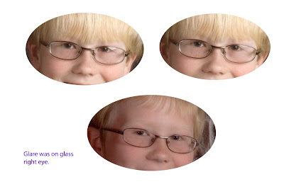 Here is another example of glare removal, using the same techniques...
 This is the original...

Here is another example of glare removal, using the same techniques...This is the original...Now can this count as a tutorial, so I am off the hook for a while!! :)
Thursday, October 30, 2008
Reflection on glasses
This is the original shot:


Working with the reflection you have to be careful that you don't take the 'life' out of the shot. This was done a over four years ago and perhaps I should redo it and see if I have gotten any better! But you get the idea of what I did.

Wednesday, October 29, 2008

Tuesday, October 28, 2008
Gradient Collage
I had been wanting to try something like this for a long time but I never could get the gradient tool figured out. Thanks Carl for the tutorial as it helped me to finally figure it out. 


This is from a photo shoot I did this weekend. The dad really loves hunting and he was reading a Rocky Mountain Elk book to his daughter. Before I left I took a picture of the book by itself. That is where the Elk image on the right side came from .
I used the "foreground to transparent" gradient tool. I went at a slight angle to have the elk fall behind the dads legs.
What I am asking from anyone who reads this is some HONEST critiquing. Do you like it, dislike it, or is there something that would make it better?
*** EDIT***
I edited this one a bit more: I did a sepia effect on it and lowered the opacity. I also did a little painting between the dads legs and the book as well as just above the book so the elk showed more and the chair would show less.
Subscribe to:
Posts (Atom)
