Friday, October 31, 2008

glass glare

This boy has trouble with glare on his glasses... the first set, you can see how I minimised it... but I could not take it all away. The second shot I did not save the original so you can't see how bad it was but that is an eye that I had to redo the lash line. Here is another example of glare removal, using the same techniques...

This is the original...


Now can this count as a tutorial, so I am off the hook for a while!! :)

Thursday, October 30, 2008

Reflection on glasses

This is the original shot:

Working with the reflection you have to be careful that you don't take the 'life' out of the shot. This was done a over four years ago and perhaps I should redo it and see if I have gotten any better! But you get the idea of what I did.


Wednesday, October 29, 2008

Can someone help or tell me how to get rid of the glare off eye glasses? Thanks!
Posted by Picasa

Tuesday, October 28, 2008

Gradient Collage

I had been wanting to try something like this for a long time but I never could get the gradient tool figured out. Thanks Carl for the tutorial as it helped me to finally figure it out.

This is from a photo shoot I did this weekend. The dad really loves hunting and he was reading a Rocky Mountain Elk book to his daughter. Before I left I took a picture of the book by itself. That is where the Elk image on the right side came from .

I used the "foreground to transparent" gradient tool. I went at a slight angle to have the elk fall behind the dads legs.

What I am asking from anyone who reads this is some HONEST critiquing. Do you like it, dislike it, or is there something that would make it better?
*** EDIT***

I edited this one a bit more: I did a sepia effect on it and lowered the opacity. I also did a little painting between the dads legs and the book as well as just above the book so the elk showed more and the chair would show less.

Monday, October 27, 2008

Working with Gradients

Here is a quick tutorial on using the Gradient Fill tools...

We are going to start with the simple Linear Gradient Tool and learn a couple of things. First of all, there are many different gradients that can be made, as shown in the graphic below of the drop down gradient options. We can make a two color gradient, a single color to transparent gradient, multicolor gradients, etc. Lets concentrate on the single color gradient to transparent.

Open a new file with a white background and we will see what we can do with the gradient tool. Select the gradient tool with single color to transparent.Now click on the left side of the image and drag across to the right side, we want a long drag mark so we have lots of transition from color to transparent.Notice how too the left of where you clicked the color is 100% Opaque and to the right of where you stopped dragging it is 100% Transparent. The transition between the two colors (Blue and Transparent) happens linearly between the two endpoints of the drag mouse operation. The gradient change will always happen parallel with the drag line, so dragging at an angle will rotate the gradient to occur parallel to the drag line.
If the gradient doesn't come out the way you would like, just hit CTRL+Z (or undo) and try it again. The gradient tool is basically a special paint bucket that doesn't cover the entire canvas uniformly.

Now lets step it up a notch and get creative using the gradient editor. Clicking on the edit button on the Gradient toolbar will pop-up the gradient editor dialogue box. Notice down towards the bottom of the box is a sample of the gradient with some squares above and below the gradient. These boxes can be moved right and left to adjust how the gradient fill happens between the endpoints of the drag operation. So if one wants a biased transition, dragging the center small diamond with bias the gradient. The end squares change where the colors are 100%, and I find it easier to not adjust those squares since it is just as easier to control that using the mouse drag operation.We can add a stop, or color definition point by clicking above or below the gradient sample. This will allow us to define a hard point in the gradient. This can be a color change, a certain amount of transparency or just give a little more control over how the gradient is built. The color is defined below the gradient sample, while the opacity is defined above the gradient sample.

Those are the very basic operations of the gradient tool, hopefully this helps and is not just more confusing. Still confused? Here is another site that contains a tutorial of Gradients

Wednesday, October 22, 2008

Using Layers

Do you have a picture that you really like, but the color is slightly off and the picture is a little dark? I started with a picture taken at night of a fire crew training, because of the distance the camera flash was worthless and the truck flood lights made the color more yellow than normal.


Focal Length: 25mm
F-number: F/4.2
Shutter: 1/3 Sec
Iso: 100
Metering: Pattern
Exp Program: Creative Biased
Exp Comp: O Step


Using layers we can brighten the picture and adjust the 'white balance' of the picture slightly, and obtain a usable picture...


Layer 0: Original Image
Layer 1: Copy of Complete image with 100% Opacity Screen
Layer 2: Selective copy of Distance building up Sky with 100% Opacity Screen
Layer 3: New layer, blue filled with 20% Opacity
Layer 4: Signature Layer
We can apply the same steps I outline for sunsets to lighten and color correct any image. Just some of the tricks and tips I have learned, look forward to seeing what everyone else comes up with using layers to edit pictures.

Note:
It would be helpful to include a brief description of your layers along with a before picture....

Tuesday, October 21, 2008

Flowers DOF

Just if this qualifies as a DOF?
Not a perfect one, but wonder
if I'm on the right track? Thanks!

Posted by Picasa

Monday, October 20, 2008

Sunsets &Silhouettes

One of my favorite aspects of digital photography is being able to process at decent picture and embellish on the the picture. For a lot of people, digital embellishment in considered cheating, but even the best of photographers miss the shot sometimes.

In my tutorial I wanted to demonstrate the power of using layers and what can be done to a photo to bring out colors and to subdue other features.

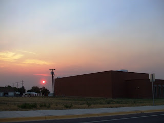
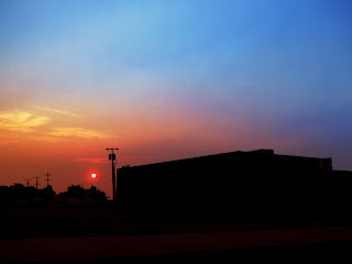
I am going to start with a sunset photograph, that has decent coloration but not perfect.Notice how the foreground has significant detail, but nothing of interest really.The foreground distracts from the colors of the sunset and would be less distracting if a silhouette.The sky coloration is good, but it is not super amazing and can use a little help to make the colors more vivid.There are many ways we can silhouette the foreground, and I will show you my preferred method that still retains some foreground detail and doesn’t look like we just painted a blob over the foreground. First we start by duplicating the background layer. ( Layers-New-From Background-Multiply with 100% Opacity)
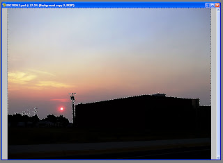
Now on the new layer we will delete the sky from the layer so we are only darkening the foreground.This is quickly done using the wand selection tool and selecting the lighter background, once everything is selected than ctrl-x to cut the selection from the layer. Quick side note:It can be tricky to leave the highlights on the objects, but that is crucial to maintain an appearance of realism to the foreground objects; look at the transformers on the power pull and notice the highlights that still remain.
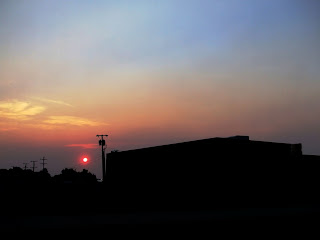
Now that we have successfully darkened the foreground, we can still see some detail but maybe we want to darken it a little more…This is easily accomplished by copying the foreground darkening layer one more time.Now we are starting to get somewhere.Now it is time to work on the coloration; during the first background layer copy I liked what the multiplying of the background layer did for the sky coloring so I am going to copy the background layer again and multiply the entire layer with opacity of 60%.This will amplify the sky colors and darken the foreground a little more.

We have turned the foreground into a silhouette and have pretty much left the sky untouched; now let’s accentuate the coloration of the sky.This will be done by using a gradient fill on a layer that is mostly transparent, using a color that we want to accent.Adding a semi-transparent layer is similar to using a lens filter on a camera, the difference being we use the color that we want to accent instead of the inverse of the color we want to accent.
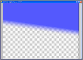
Lets start with the blue.Create a new layer that is a soft light and about 50% transparent.Using a blue foreground color lets do a single color gradient to transparent in the upper portion of the layer. We want the blue gradient to stop before the sky colors start becoming orangish-yellow.Once you have the blue layer done, lets add another one that is red, same process but we want the red layer to cover the bottom half of the photo. Ultimately you will want some natural sky coloring between the two layers so don’t worry about matching up the gradients perfectly.
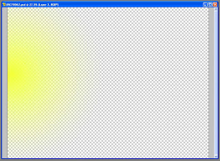
This process has subdued the yellow, so now let’s bring some of the yellow back.One the yellow layer we will use a circular gradient that centers on the edge of the photography in the transition zone from red to blue.This will add a yellow flare to the photograph.
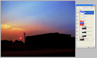
Now that we have our color filter layers we can play with their individual opacity properties to adjust the coloring.REMEMBER, we are embellishing the natural colors of the photograph NOT completely changing them; so cautious that the colors are not over accentuated and made to look fake or surrealistic.Now that we have arrived at our desired outcome, let’s see how much each layer has changed the photograph.Clicking on the eye symbol under the layer properties will hide a given layer, this should demonstrate what effect each layer is having. Colors might be a little vivid and bold in the final picture, but it shows how drastically we can change the coloration of a picture.
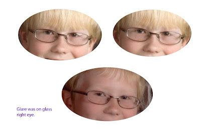
Friday, October 17, 2008

DOF with Point & Shoot Camera


Picture Information:
F-Stop : F/7.2
Focal Length: 9mm
Shutter: 1/64 Sec
Flash: 1
Iso: 200
Exp Comp: 0 Step


Well, since I have not ventured out and purchased a high end digital camera, I have been trying all sorts of things with my point and shoot camera. I have yet to try portrait mode to see how that works for DOF (Thanks Cy), but here is what I was able to get using the macro mode on the camera.

I am hoping to play around a little more this weekend and will update my post later...

Thanks Cy for a great challenge, makes me go back and think about the basics of photography again and how to take control of my camera...

Additional Pictures...

I borrowed a DSLR camera for the weekend and had loads of fun getting more pictures and playing around with DOF. Here are a couple of them that I thought were amazing...


F-Stop : F/3.9
Focal Length: 74mm
Shutter: 1/20 Sec
Exp Program: Aperture Priority
Iso: 100
Exp Comp: 0 Step


F-Stop : F/4.3
Focal Length: 123mm
Shutter: 1/20 Sec
Exp Program: Aperture Priority
Iso: 100
Exp Comp: 0 Step

F-Stop : F/4.5
Focal Length: 150mm
Shutter: 1/800 Sec
Exp Program: Aperture Priority
Iso: 100
Exp Comp: 0 Step

Wednesday, October 15, 2008

Still Life DOF

For each of these pictures I used the apperture priority setting on my camera. f/2
1/4000
ISO 100
50 mm


f/1.8
1/100
55mm
ISO 100

Tuesday, October 14, 2008

DOF Example

Here is an example of DOF. I needed some pictures of Jelly Beans for other reasons, so I just played around with the DOF to get this effect...

f/5.6
1/4000
55mm
ISO-400


Anyone else got an example???

Cy

Sunday, October 12, 2008

What's a depth of field anyway?

I thought of a lot of examples of depth of field where I tried to be funny and came up with the following... I couldn't think of a funny way to approach the subject. I guess I didn't inherit great creativity from my daughter... go figure.


Simply put, depth of field is that area in an image that is in focus - some say acceptable focus. The area in front of or behind the subject can either be in focus or out of focus, depending on the effect for which you are looking.


There are several factors that affect depth of field: apature, distance to the subject, iso, the lense you are using and shutter speed. What I will focus on here (pardon the pun) is apature because it has probably the greatest affect. Suppose you want to take a picture of your middle brat standing in front of a tree and you want the tree in a soft blur. This effect tends to draw attention to the middle brat (and everybody knows he needs more attention). You need to setup your camera with a large f-stop of f5.6 or larger (remember a larger apature would be f2-a subject for another blog). Then move in pretty close to the middle brat and shoot the picture. Focus on his eyes and everything behind him should be out of focus. That's it!


The sketch below will sort of give you an idea of depth of field in a quick glance:


Graphic of Depth of Field


Now for some examples. This first one was taken a f5.0 with a shutter speed of 1/15 and the iso set at 400.


The second example was shot at f16 with a shutter speed of 1/6 of a second. As you can see, it si completely sharp.


Have fun and practice...


Cy

Thursday, October 9, 2008

Sunset Vignette

I got busy last night and played around with different pictures. I am mostly a sunset and landscape variety so it was a bit of a challenge.
Some Original Picture Statistics:
Camera: FinePIX A900
Focal Length: 9 mm
Aperture: f/2.9
Exposure: 1/180 sec
ISO: 200
Exposure Compensation: 0 Step

For the above Vignetting, I used a gradient layer that transitioned from red to yellow (50° angle up and to the right), Square selection with a corner radius of 150 pixels and feathered at 75 pixels; the layer properties were color burn with 100% opacity.
For the above Vignetting, I used the same layers but just tweaked the layer properties; New layer properties were exclusion with 26% opacity, Multiply with 100% opacity and soft light with 8% opacity.

All this was done in Elements 2, yeah I know a bit behind the time on versions but I resist change (hence my political affiliation this year)...

Wednesday, October 8, 2008

My vignette

For this picture I did the following:
Background copy set to Soft Light at 52% opacity
Saturation Level: Master Saturation at -95 Yellow at + 95
Brightness/Contrast Level: Bright at 26 Contrast at 22
--- and finally for the vignette, I used the lasso tool to draw around where I wanted ( I decreased the black opacity before doing this so I could see). Feather 75 Opacity 43%

Please, please feel free to critique.

Tuesday, October 7, 2008

A Few Suggestions

Here are a few suggestions regarding upcoming posts.

* With regards to photography it would be great if you could share your information with regards to the photograph statistics. It could look like this:

Camera: Nikon D80
Aperture: f/5.6
Exposure: 1/15 sec
ISO: 100

* With regards to Photoshop share some information about what version you use and what you did with your work.

It doesn't have to be complete but I believe it will help us all learn by seeing how others are accomplishing their work.

-----------------------------------------

---ALSO---

If anyone has a question or suggestion there is NO NEED to wait until your given Monday. Fire away and ask those questions! That's why we are here!

Monday, October 6, 2008

Vignetting

For this tutorial I am using Photoshop Elements 6. I had been using the burn tool to accomplish this but this is just another technique to get the burned-edge or vignette. First, open up the picture you would like to place a vignette around.

Next, go to the layers pallete and open up a new layer. Press the letter D to set your foreground color to black. Now press Alt-Backspace to fill this layer with black.


Next, press M to get your Rectangular Marque tool. Drag your selection out with the Marque tool. For this particular one I went about an inch in. Now you need to feather your selection. Go to Select > Feather and choose a Feather Radius of 80-100 or whatever you like. Your edges should now be softened. For this particular photo I used a feather of 150 so the results would show easily.
Now just press Backspace to reveal your vignette. Then go to Opacity and lower the slider down until it reaches a look you are looking for. I realize this may look better on a portrait or another photo, I just wanted to show you this technique.

Alternatively, you could use the Oval Marque tool. Or, my favorite, use the Lasso Tool to freehand draw a more irregular pattern.

Rather than use black you could also set your background color to white or another color that compliments your work.

Just a few suggestions. Looking forward to what you create with the burned edge or vignette.

Sunday, October 5, 2008

Print Screen

Talk about getting out of your comfort zone and learning something new. I thought I had better teach myself how to do a screen shot if I was going to attemt the upcoming tutorial I have planned.

Here goes:

When you have your screen a way that you would like to share it (such as a Photoshop shot), press the Prt Scr located just above the Backspace.

Now go to Start > All Programs > Accesories > Paint. When Paint opens up right click in the open space and click Paste. Now all you need to do is save it in My Pictures (or whatever you use to upload photos to Blogger).

That's it. Pretty easy I hope.

Wednesday, October 1, 2008

Welcome!

Welcome to NO COMFORT ZONE PHOTO. Have you ever noticed that most people tend to get into a comfort zone. Dare I say rut? I know I can. I created this blog so that we can all get together to help one another get out of our comfort zone. Our photography comfort zone. Our Photoshop comfort zone. This is our chance to come together, teach one another, encourage one another and in turn we will grow as photographers.

Some suggestions for post entries could include the following:
*How I did it. - This could be anything from HOW you took a particular photo to HOW you did something in Photoshop. A tutorial if you will.

*How would you do it? - If you are having difficulty accomplishing something ask for advice on how to accomplish a particular photo, exposure, pose, composition, etc. or something in Photoshop

*Present a challenge -

*Ask a question -

*Share a photo - and ask others to either critique that photo or ask the others to try their hand at something similar, this may fall into the challenge category.

Please keep in mind that just because you have been doing something over and over doesn't mean someone else knows how to do it. That is where we fall into our comfort zone. By showing others what you know, you may be teaching them something completely new. My thought that is by TEACHING we become better LEARNERS.

Each Monday one person will post the main entry for that week. Keep in mind that you can always prepare your post early and post it Monday using the "Post Options".